How to Create a Professional-Looking Book Cover: DIY Design Do’s and Dont’s

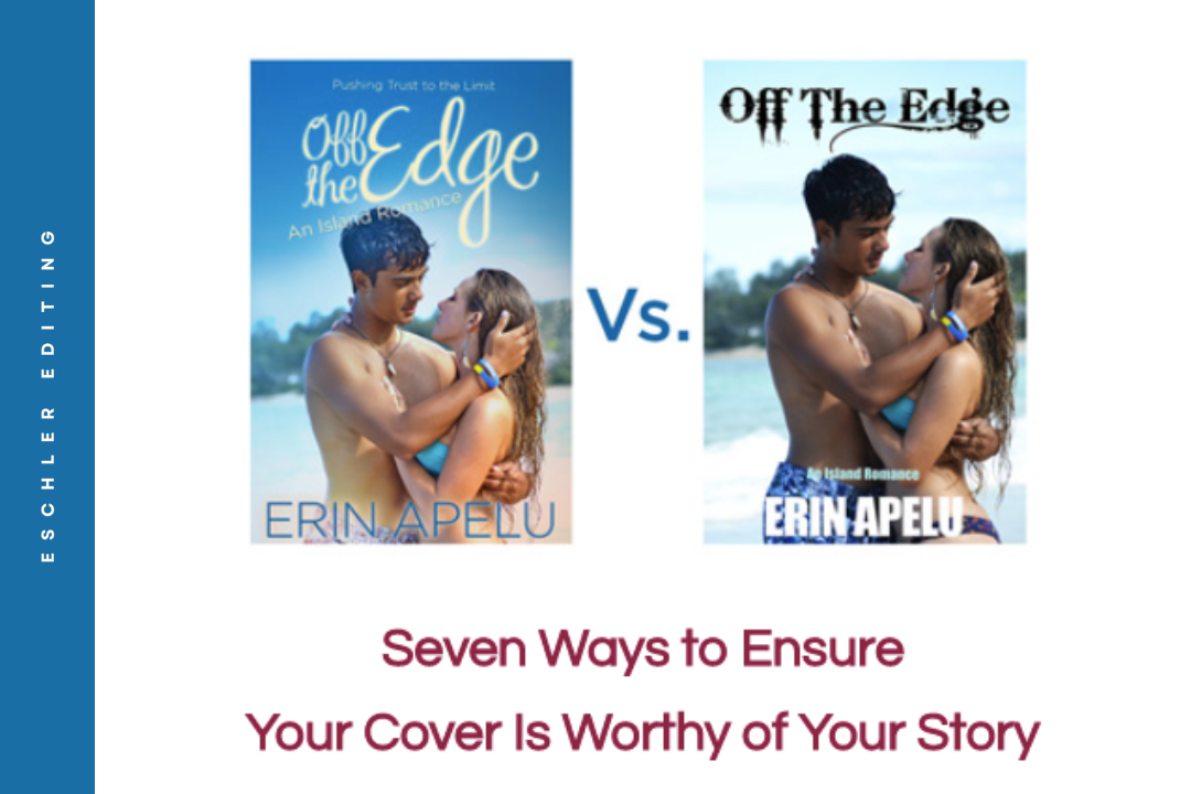
Book covers! We love ’em but we hate them too… once we see the price tag that comes with a professional artist. If you’ve decided to make your own book cover, it’s easier and more affordable than ever.

BUT, an unprofessional or lackluster cover will result in poor book sales, while a polished, eye-catching design will draw the right types of readers to your book. Your book cover is your best sales tool – you really need to nail it!

So, to help as you design your own cover or pursue working with an artist, we’ll examine the following marketing concepts and cover art guidelines:

  1. Your book cover is your #1 marketing tool
  2. The visual elements of a strong book cover
  3. Affordable cover design tools
  4. Hiring a book cover artist
  5. Market testing your book cover

NOTE: since I specialize in sci-fi and fantasy, all the cover examples will fall within these genres. However, my general advice about marketing angle, artistic direction, and design programs is applicable to all fiction authors.

Your Book Cover is Your #1 Marketing Tool

Your book cover is your most effective marketing tool. And that’s how you need to think of it. You probably have a ton of images in your head of favorite scenes, cool characters, and dramatic vistas.

But accurately conveying the beauty of your world or main character is NOT the most important element of your cover. A cover is only effective if it will make your target reader pick up your book (and ideally buy it).

So first, you need to have an ideal reader in mind. You can learn more about this in my earlier post: “The Most Important Marketing Concept Authors Need to Understand.”

To interest your ideal reader, a cover needs to convey:

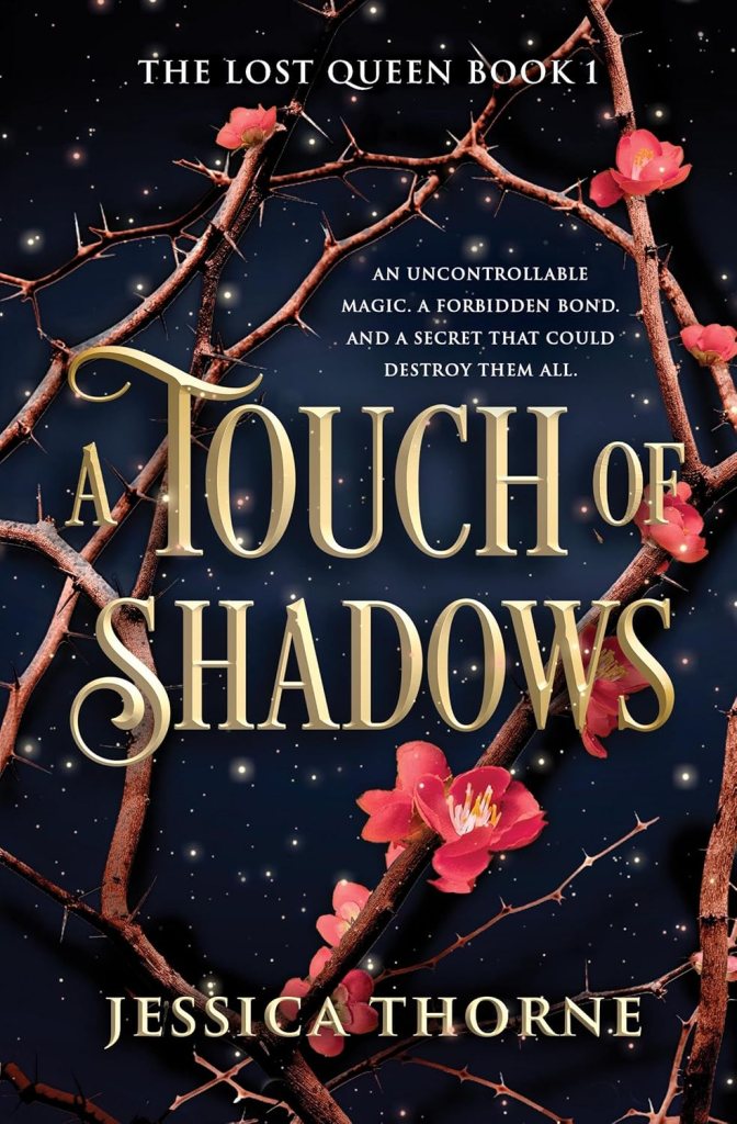
  1. Genre – a fantasy book looks a lot different than a contemporary romance. Make sure to use the general trends that are appropriate for your genre AND sub-genre. First impressions are lasting!
  2. General tone and themes – use color scheme, lighting, and subject matter to narrow your audience – is there a male or female figure on the front? A close-up of a face, or a unique, sprawling vista? Cool or warm tones?
  3. Accurate reader expectations – if your book doesn’t feature a lot of romance, you won’t want a steamy couple on the cover. If there’s a dragon on the cover, that dragon better show up! If your cover looks bright and cheerful, but has a tragic ending, readers might be miffed.

It is vitally important that you follow through on “the promise of the premise.” If your cover promises “high concept space opera” and you deliver “found family scrapping by in space,” you’ll irritate the readers who do pick up your story, and fail to find the ones who’d truly enjoy it.

Have you heard of “Chekhov’s gun?” It’s a phase that originated in the film industry – if you depict an element that has exciting connotations – like a gun, legendary sword, dragon, or battle – that element better show up in the story, or readers (viewers) will feel misled and let down.

Your cover makes a “promise” about the type of story and emotions readers can expect. Keep that promise.

How to Do Market Research

The best way to ensure that your book signals to the right type of reader is to complete market research. In other words, look at other covers within your genre and sub-genre to see what’s resonating with readers.

Look up your favorite authors. Skim through lists of Amazon new releases in your category. Save your favorite (genre-relevant) book covers to a Pinterest board.

What catches your eye? What do you skim past without really noticing?

Your own tastes are a good place to start, but it’s important to poll a wider field. There are some great communities online where you can post cover mockups, in-progress works, and alternate versions, and ask readers to vote on them!

Just make sure you’re polling people who actually read within your genre. Facebook, Reddit, and Discords have pretty active groups that tend to be pretty kind, in my experience.

Trends come and go, especially on social media – ask readers what designs they love, what turns them off in a cover, and which version of a cover looks best. These are effective ways to ensure that your cover not only looks professional, but also has the highest chance to sell your book.

Fit in But Stand Out

It’s important to find a balance between originality and familiarity. You want readers to look at your book and, within 0.01 seconds, understand what genre and sub-genre your story falls into – that’s all the time they’re going to give you.

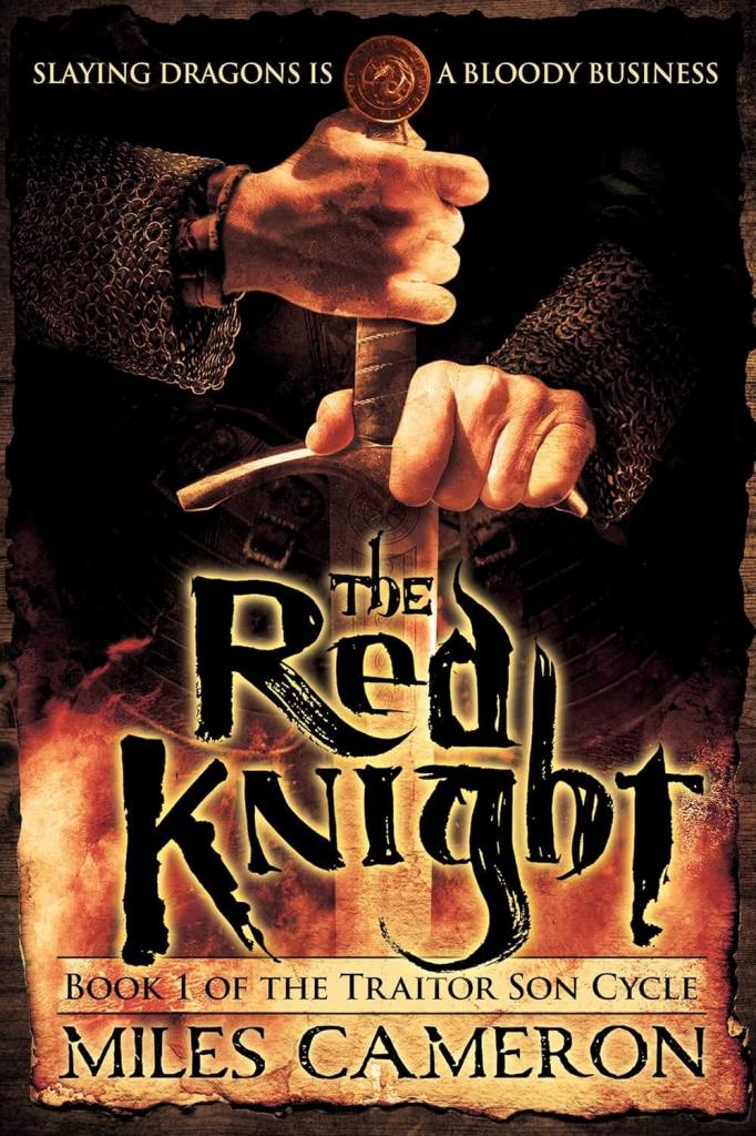
However, you do still want to stand out. A book cover with a close up of a sword’s handle may convey “sword and sorcery” plenty effectively, but that’s all it does. Seriously, enough already – this tells me absolutely nothing about your story!

The same goes for the plethora of covers that feature a noblewoman in a puffy dress, a cloaked boy facing off against a dragon, or a random space ship hovering over a planet.

You need to imagine not just how your book will look on its own, but how it will compare when stacked up against the competition – literally stacked in a pile at a bookstore, or more commonly these days, on an Amazon new releases list, Instagram or TikTok feed, or any other online platform.

These covers all look sharp and effectively convey “dark romantasy,” but because of the vague titles and intense similarity in visual elements, I get overwhelmed when looking at them all. I don’t know how they stand out from each other. I’ve stood in bookstores reading the back covers of books like this, and then as soon as I set them down, I forget which description goes with which title.

That’s why when covers like this come along, in the same genre and sub-genre, they shoot to the top of #booktok lists – because they stand out, while still fitting in!

So scroll through those lists! And especially look at the books and authors you’re using as comparative titles. You may love covers that use graphic design, but if your comps use highly realistic oil paintings, you may want to consider using that style to flag the same readers.

The Visual Elements of a Strong Cover

Choosing Fonts

I’ve put this at the top of my list of visual elements because unprofessional fonts are the most common mistake I see on covers these days. With photo manipulation, pre-made covers, and accessible programs like Canva, it’s more affordable than ever to acquire an attractive image for the base of your cover.

But a generic, improperly formatted, or genre-inappropriate (e.x. corporate text on a fantasy book) font will scream “amateur” even if you use a great image.

The above covers make the following mistakes:

  • The font is simplistic, more fitting to a word document than a cover
  • The color of the text doesn’t stand out well against the background
  • The font is too small
  • The title and design compete, rather than working in concert – part of the design is obscured, and part of the text is less readable – neither win (more on this in the next section)

Here’s a simple rule of thumb for picking your actual font: if you’d use the font in an email, DON’T use it on your cover (except in your blurb, which should be highly readable).

If a font is available for free in a word processing program, it probably won’t look professional on a book cover. It’s absolutely worth it to pay $15 for a month of Canva premium to select a few unique fonts.

A book’s title, author, series name, and any taglines or testimonials are often written in different but complementary fonts. Keep that in mind as you look through examples.

Focal Point and Composition

Focal Point

A book cover needs a strong focal point – the place in the image that your eye is instantly drawn to.

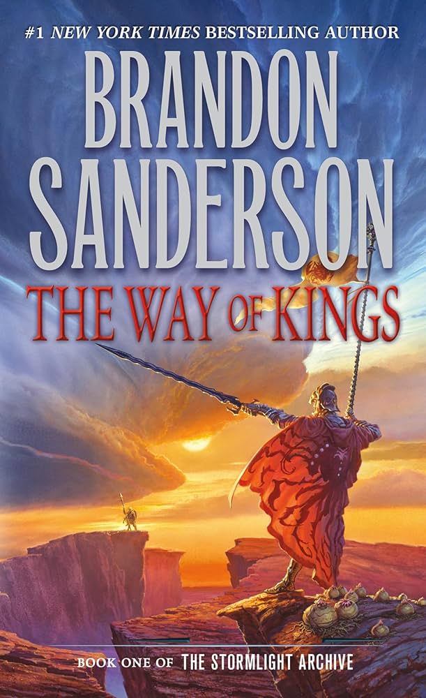
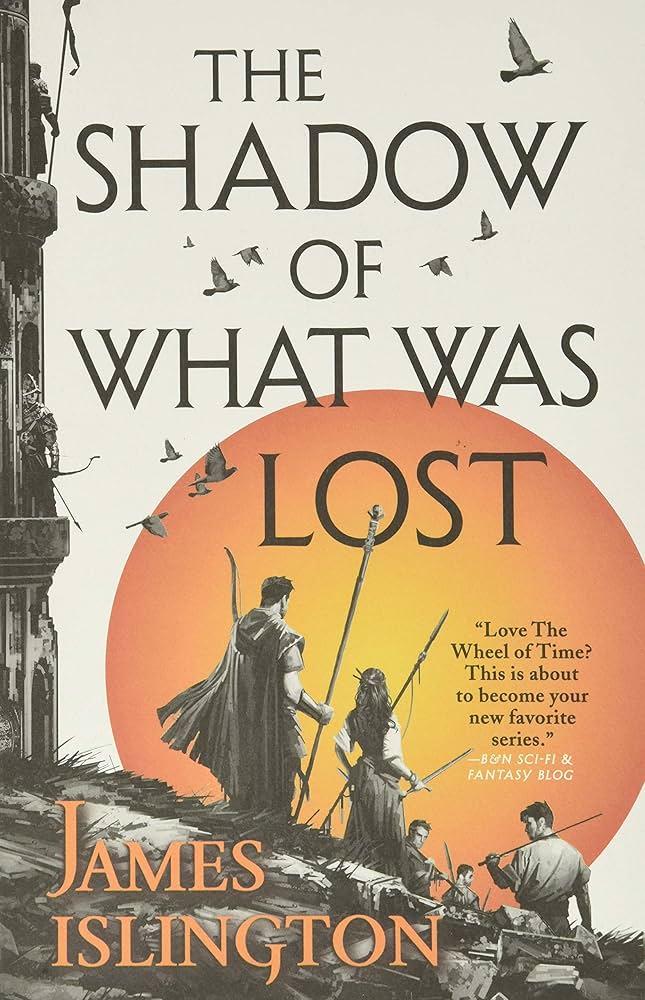
Covers tend to use either the title or the image as a focal point. Note that in the first two covers below, the image and backgrounds are relatively simple, while the text is much larger. In the second two covers, the images are much more striking, causing the eye to fix on them immediately.

Both choices are valid – just make sure that your text and image don’t compete with each other, like on the Realm of Dragons cover above.

Ensure your image has enough negative space for your title, or an area that is simpler in texture and color, so the words don’t have difficulty showing up clearly against the design.

Rule of Thirds

The rule of thirds is a useful compositional strategy that divides an image into nine equal parts with two horizontal and two vertical lines. It’s recommended to place key elements along these the lines, at their intersections, or within the segments.

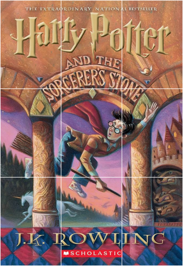
Our brains like segmenting things and following patterns. Harry Potter is placed squarely in the middle of his cover, and the title takes up the full top third. The pillars frame him pretty closely along the horizontal lines of the thirds.

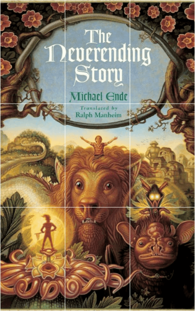
On The Neverending Story‘s cover, each “third” in the bottom only contains one fanciful creature, giving us some mental space to process one and then another. The mandala motif on The City of Brass takes up exactly the top 2/3 of the image, with the pillar of fire and figure strikingly illuminating the center “column” of the book.

Guiding the eye

Using the rule of thirds is also helpful in designing a composition that draws your reader’s eye around the full frame – from image to title, to author’s name, and back again.

Amok‘s cover by @jiwosophy does a stunning job of this!

1. The title starts at the top left focal point, taking advantage of the reader’s instinct to read from top left to right.

2. The curve of the woman’s body along the top 1/3 of the image follows our reading path, ending in a second focal point – her face.

3. The linked arms and blades then cleverly lead us to the author’s name!

4. The dynamic curve of the young man’s body draws us to his head, which rests at another intersection of two lines.

Significantly, we don’t see his face. If we did, it would likely compete with the title for attention, as the human eye gravitates toward faces. The back of his head still serves as a focus, and his outstretched hand points us upward toward the woman’s feet, and back to #1 – the title.

Masterful! Not to mention, the motifs and style of this cover hint at the story’s unique worldbuilding – inspired by author Anna Tan’s Malaysian ancestry.

Artistic Style and Medium

Artistic style is one of the best ways to give readers a hint of your writing style and the “feel” of your story. As my lit professor loved to say, “form reflects meaning.”

Some top design styles include:

  1. Traditional media – oil painting or watercolor
  2. Digital painting
  3. Real life images – models, landscapes
  4. Cinematic cover
  5. Culturally or historically inspired artwork – Chinese ink painting, Greek pottery motifs, and wood cut prints
  6. Graphic design
  7. Mixed elements

Medium hugely impacts the depiction of light and color – watercolor or acrylic will look much softer than richly saturated oils or bright digital paintings. So this choice will greatly affect your book’s perceived sub-genre.

What style makes you the most excited? More importantly, which one makes you want to pick up the book?

It’s SO hard, but the most beautiful cover, isn’t necessarily the best cover. It’ll save you a lot of pain down the road if you accept NOW that some images are best left as supplementary art or interior illustrations, rather than as your cover.

You want to pick the style that best sells both your book and your brand as an author.

Here are some various covers for The Fellowship of the Ring over the years, and they each convey something different about the story. The 1st image is the original cover design, the 2nd cover looks more like a children’s book, the 3rd reveals the beautiful scope and literary quality of the work, the 4th is more cinematic, the 5th is a graphic design call-back to the original cover, and the 6th looks like a modern dark fantasy.

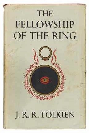
All these covers say something true about the story, but appeal to different readers. What type of reader do you want your cover to speak to?

Depicting Your Character

Some readers hate seeing characters on book covers, while others love it, or don’t really care. The choice is yours.

Characters are usually depicted on covers in one of 5 ways: silhouettes, shots from behind, multiple characters interacting, half or full body front view, and close-ups of faces.

1. Character silhouettes

In this style, characters are often seen from a distance or depicted through a simplified art style – little can be made out about the character except for gender, and pose.

These covers work harder to indicate their genre and sub-genre than to communicate what is unique about the main characters. These are meant to be archetypal depictions that make a reader think, “I like stories about swordsmen, or ladies in Victorian times.”

What to avoid:

You’ll want to be careful not to overuse graphic design elements that look like clip art cutouts. I’ve seen the same silhouette of warrior girls and dragons on so many book covers that it has become distracting. All I have to do is open Canva and I know exactly which one they used, which makes a cover appear less professional.

2. A figure shown in profile or from behind

In these cases, we don’t see the character’s face clearly, but are given more intricacy in clothing and other features.

This is a great way of indicating more about the personality and profession of your main character – soldier, noble, spy, alien, and so on, without committing your readers to a certain version of their face.

What to avoid:

The Name of the Wind cover: a cloaked figure faces a single tree in an overcast grassland, the world tinged a blue-grey.

You don’t want to be too vague here. I’ve seen a ton of fantasy covers that feature a cloaked or armored figure from behind, or a young woman with her hair blowing, and these figures don’t really tell us anything about the story or character. The examples above give enough detail to let us know general ages, professions, culture, and potential goals.

3. Covers that depict multiple characters

If your story centers around dynamics between one or more characters, featuring multiple figures on the cover can be a great way to establish reader expectations. You’ll let them know that the heart of the story centers around love interests, buddies, rivals, found family, master-apprentice relationships, and so on. Readers will also often assume that such a story follows multiple point of views, which is useful information to convey.
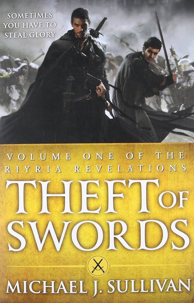
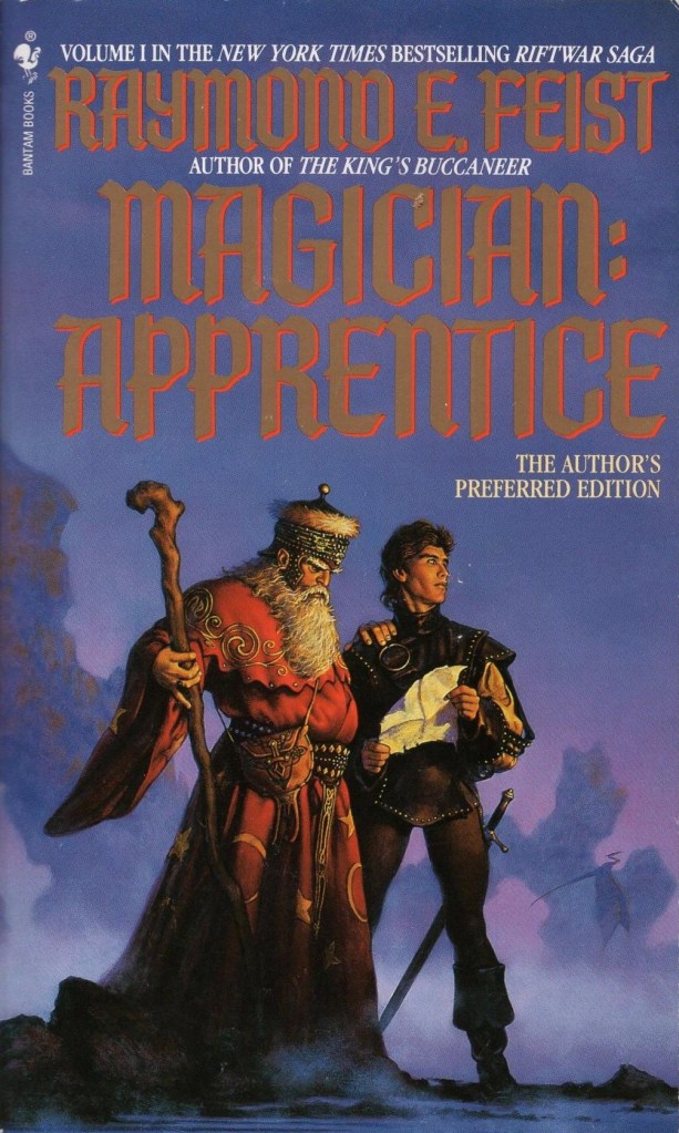
What to avoid:

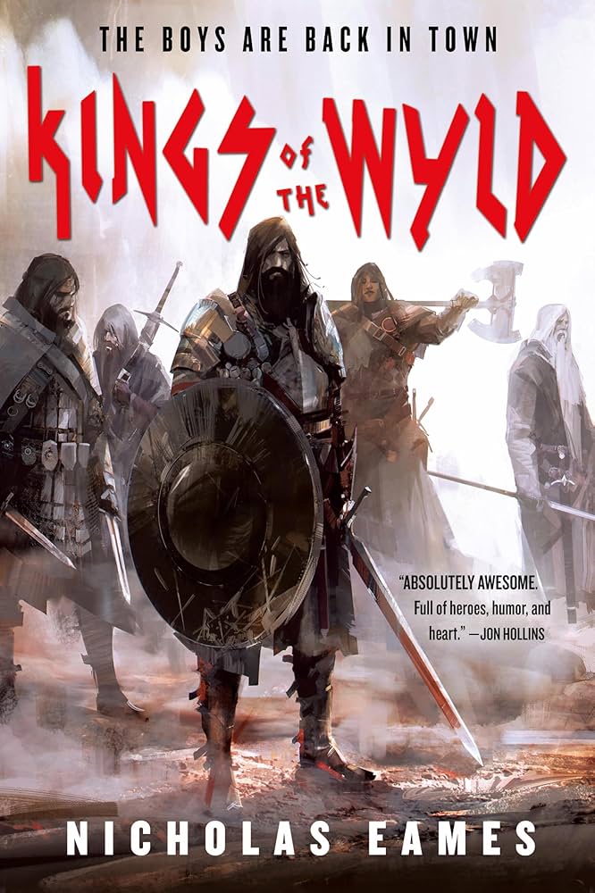
Including too many characters on one cover can become distracting. It also makes it a lot harder to maintain continuity in later covers or if you have to change artists. Note that Kings of the Wyld, which features the most characters of those examples, still uses one character as a focal point, while the others fade into the background a little.

You also want to avoid having characters just stand around. In the covers above, the characters clearly have a task before them, and are not just posed before “the camera.” They look ready to solve a problem or leap into action.

4. A front view of the character (half or full body)

If you don’t mind committing yourself to an artist’s rendition of your character’s face, then go all in with a front shot!

The most effective character shots are dynamic, emotional, and indicate another layer of the world (plot, magic). These characters feel like they’re in the middle of a scene, and we’re holding our breath, waiting to jump in and see what happens next.

What to avoid:

Assassin's Apprentice cover: a boy in a blue cloak clutches a dagger at his waist, a buck visible behind him in the mist.

You’ve likely seen many covers that show a character just facing the reader (as though looking at a camera), with a rather neutral facial expression and body language.

These depictions, while potentially “accurate,” are rather boring to look at. You want to at least partially answer the question: what makes this ranger, orphan, or prince different from the others?

5. A close up of a character’s face

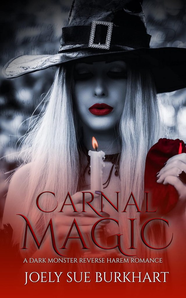
This can be a very effective way to communicate something unique about the main character, display intense emotions, hint at a major theme in the book, or just show off a hot character! 😉 A close up can also indicate that the story will follow a single character’s perspective quite closely – perhaps even in 1st person.

What to avoid:

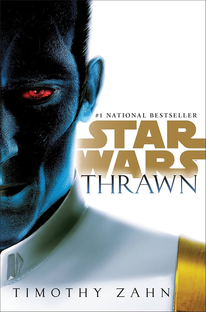
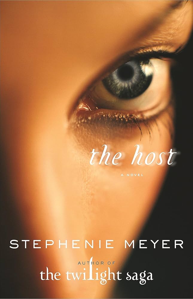
If you’re going to depict a character’s face prominently on your cover, you MUST maintain consistency across the series. Here is an example of a series that failed to do this.

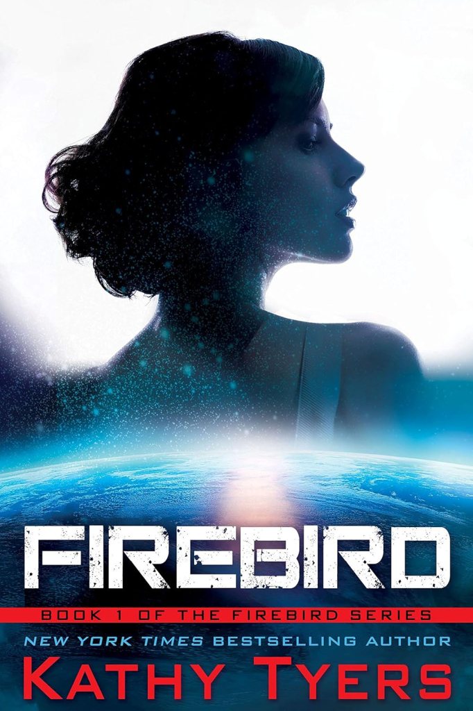
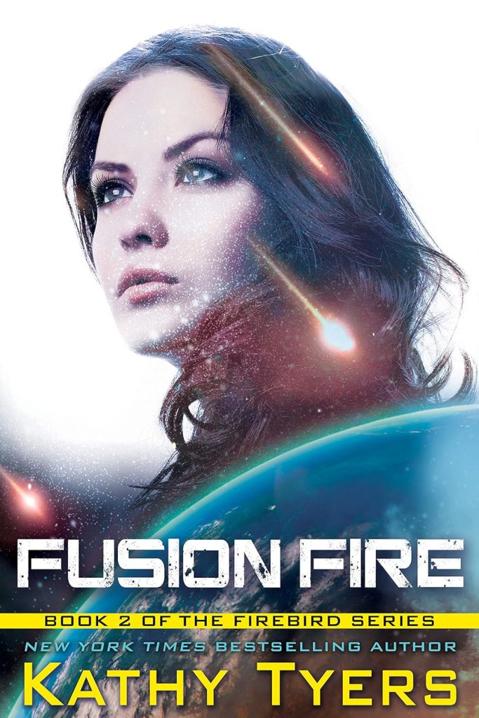
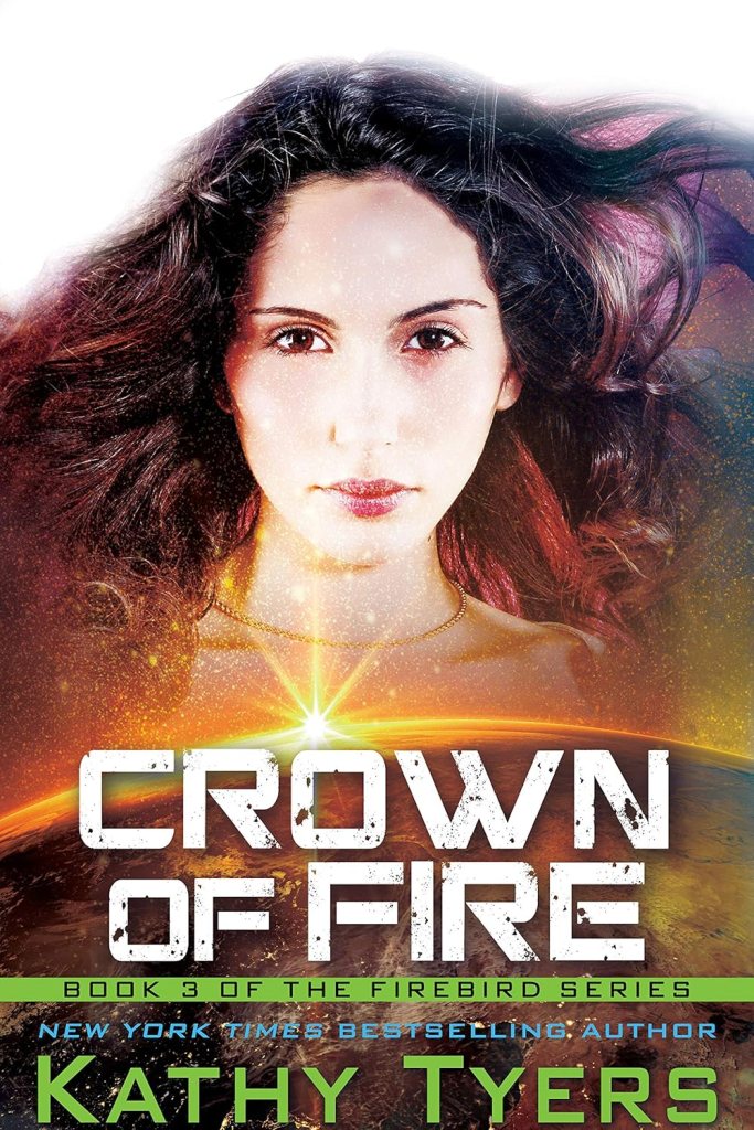
These book covers all feature a different model, and none of them actually look like the main character, who is a redhead, not a brunette. Her face tells me nothing about the story or who she is – her expressions are passionless. These are also all essentially the same cover – a woman over a planet – which tells me nothing about how the series might progress.

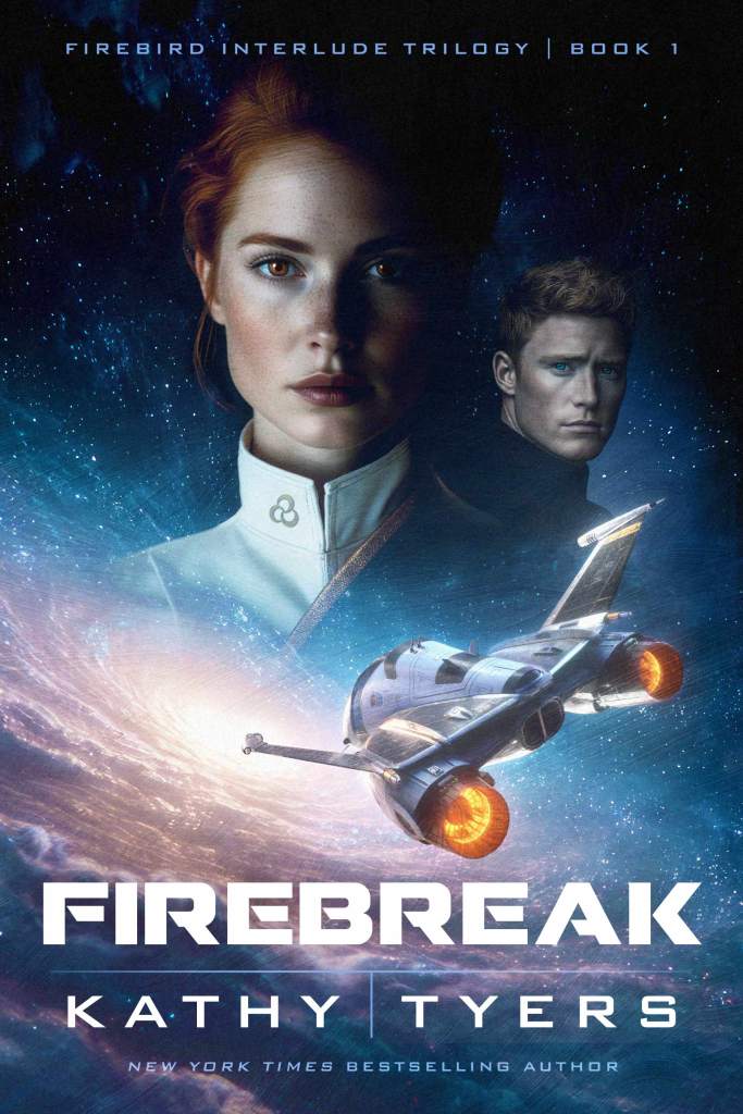
In contrast, the most recent cover in this series actually depicts the point of view character accurately, down to her determined stare and dress uniform. We receive more information, including a fighter jet, which indicates the military themes of the book. Plus an accurate portrayal of her husband, and the inclusion of a unique celestial body, rather than a generic planet.

In summary, the face of a character rarely in and of itself creates a complete cover. Other elements, including clothing, lighting, and emotion, are incredibly important to hooking a reader.

Also Avoid

the uncanny valley

When creating faces digitally or with the use of photo manipulation, it’s easy for a figure to fall into “the uncanny valley,” the name for the unsettling, even repulsive, feeling people experience when encountering humanoid figures or artificial entities that are almost, but not quite, human-like.

Think creepy doll effect, photoshop catfishing, or CGI animals whose mouths and eyes don’t quite match up with their words.

Here are some examples of covers that look “off” because of over-photo-manipulation and the blurred effect of digital brushstrokes.

In addition to looking amateur, they just feel a bit creepy, which is the last thing you want a prospective reader to take away from your book. Make sure to look at an artist’s portfolio before you hire them. If you’re not confident your artist can depict faces well at your budget, it’d be better to simplify the design or show your characters from behind than to end up with this kind of effect.

Bad Photoshop

Badly photoshopped covers are less common these days. The technology is more accessible even for amateurs, and it’s a lot easier to find freelance artists on platforms like Fiverr that are both affordable and have better skills than those displayed in the covers below.

Still, it’s good to keep in mind that just because you can cram a lot of fanciful elements or light filters into one image, doesn’t mean you should. Even if the image layers are merged and shaded properly, such covers can still look a bit… extra.

AI-Only

This is a whole can of worms. But as a business, Creative Cornerstones takes a very simple approach: don’t do it.

AI can be a fun tool to create mock-ups for your own enjoyment, to brainstorm ideas, or to provide references for your artist.

But DO NOT use a fully AI crafted image as your book cover.

In order to create these images, AI scrapes existing art and copies it, stealing the hard work of real artists. You open yourself up to a word of copyright issues. Most lawsuits about AI are still ongoing, and you really just don’t want to risk it.

There are many ways to create a book cover for next to nothing.

Besides, readers can tell when a book cover is AI-made and often they won’t pick it up as a result. I participate in many author groups online, and when authors posts covers asking for feedback, one of the top, most repeated comments I see on AI artwork is, “if I saw this on Amazon, I wouldn’t buy it because it looks AI.”

Often, readers might not care about the AI art itself, but what it indicates about the work as a whole. It shows that the author didn’t have the budget to hire a professional artist, which means other elements about the book might lack professional refinement as well – especially the writing quality. They might think, “was this book ‘written’ by AI too?”

There are SO many books on the market, that if a reader has even the slightest doubt about the quality or ethical construction of your book, they’ll simply move on to something else.

Affordable Cover Design Tools

Whether you’re looking to create your cover by yourself, or simply want to make a mock-up for your artist, there are some great programs that are affordable and user-friendly.

  • CanvaPro: $15/mo
  • Adobe
  • Book Brush: $149/yr (this one is designed specifically for creating book covers, ads, reels, etc. with tutorials and templates)

Canva and Adobe Express both have completely free versions too, but I highly recommend getting the upgraded version just for a month – there are way more templates and design elements available that will make your cover easier to create and more professional-looking. Since hiring an artist could cost $50-2000, $10 or $15 is nothing.

For more information about technical details such as image dimensions, trim size, and printing details, I suggest you directly consult your publication platform’s requirements.

Cover Specifications:

Hiring a Cover Artist

I do recommend hiring a cover design artist, at least as a consultant. There are a lot of refinements you may not consider, such as genre-appropriate lighting filters and color tone, or how much you should brighten an image to make sure it looks good once printed.

“Fixes” like this could take an artist just half an hour to spot and correct, saving you a ton of trial and error and pain down the road.

These days, I hesitate to recommend freelance platforms like Fiverr, because it’s hard to tell whether an artist’s work is genuine, or if they use AI and still charge “full price.” I’ve seen a lot of posts lately by authors who were burned by artists (often from abroad) who lied about their work, charging $100s-1000s upfront and then delivering work that contained obvious AI mistakes (distortions, disproportionate figures, oddly repeated patterns, etc.).

I strongly encourage you to choose an artist based on word of mouth recommendations. Ask people in your writers group, at local conventions and book fairs, and in online groups specifically designed to help artists and writers connect.

If, while doing your market research, you find an artist whose work you really admire, why not reach out? Don’t assume their work is outside your budget! Artists who work with small and indie presses usually have much lower rates than those who’ve created covers for the Big 5.

Here are 3 cover artists I recommend, in order of cost ($, $$, $$$):

1. Galadriel Coffeen, our in-house artist creates sharp, digitally painted covers that feature high contrast, striking colors.

  • Her covers range in cost from $50-500, depending on design complexity.
  • She also paints dragons and dramatic character illustrations!
  • See more of her portfolio here.

2. Kirk DouPonce of DogEared Designs creates luminous covers for sci-fi, fantasy, and thriller books. At the moment, he is not accepting new commissions, but if you like his work, you can check back in the future and reach out on his website for a quote.

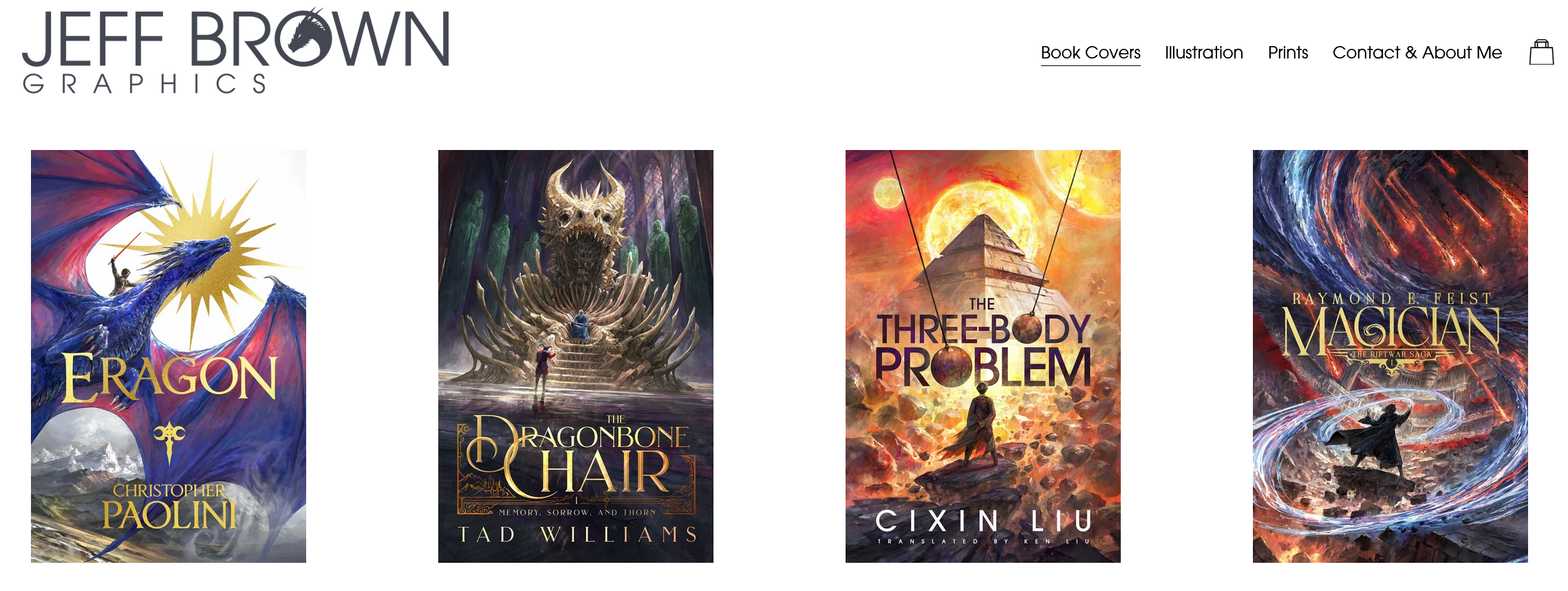
3. Jeff Brown has created stunningly epic covers for indie authors and big names alike. He charges $4000, which includes typography, full usage, multiple print covers, multiple deliverables, etc. and is currently booked over a year out. Find more examples and information on his website.

Market Testing

One more hugely important reminder: once you have a couple versions of your cover, test their effectiveness! Ask your target readers (on social media, in your newsletter, in groups, at book events, etc.) which cover they’d be more likely to buy.

You can even ask what the cover says to them about:

  1. Genre (and sub-genre)
  2. General tone and themes
  3. Reader expectations

Readers LOVE seeing covers and voting on which ones they like. Don’t assume that just because you and your artist love it, they will too.

You can’t just “change it later,” as it becomes extremely complicated to list various cover editions on Goodreads, which is one of the major platforms for gaining reviews.

Learn More

If you’d like to learn more about creating a competitive cover, I recommend Eschler Editing’s Pocket Editor course: Crushing Your Cover. They go into further detail about cover design strategies for various genres, including nonfiction. You can use the code Cornerstones10 to receive 10% off the course.

I work with Eschler Editing, an award-winning team with over 25 years of publishing experience. They’ve successfully launched work with bestselling authors, traditional publishers, and indie creators.


Hi, I’m Caylah Coffeen, a freelance editor and marketer of sci-fi and fantasy books. I love reading and writing and am a follower of Jesus Christ.

I’ve worked for Monster Ivy Publishing and Eschler Editing, and am currently a weekly editor with Havok Publishing. Reach out to chat about books and publishing!

Thanks for stopping by my website! I hope you’ve found some helpful resources about reading, writing, and publishing. If you liked this article, here’s some more free content…

How to Set up an Author Table for Maximum Book Sales

Guest Post by Dylan West

There are many benefits to selling books at in-person, local events, including finding repeat customers, gaining reviews, and selling more books in one day than you can sell in a whole month online! I’ve outlined some more benefits in a previous article: 8 Reasons Authors Should Sell Books at In-Person Events.

But here, I’ll share what I’ve learned from years of successfully selling books at markets, library fairs, and more. Knowing what to do, and just as importantly, what not to do, will ensure you actually make a profit. I’ll explain some vital tips like:

  1. How to select good events
  2. Simple tactics to sell books – inoffensively
  3. How to set up your table for maximum engagement
  4. What to bring
  5. Insider tips

How to Select good events

Ask other vendors or the even organizer what you can expect at their event. They won’t be offended and can give you an idea of the type of crowd to expect, and whether the event is worth your time.

High Traffic Events

The most important element to look for is high shopping traffic. If 10 people come to your event and you historically sell to 10% of the people you speak with, you might sell only 1 book at this event. If 500 people come to your event and you manage to speak to 100 of them, you might sell 10 books.

It’s most likely that the traffic will be high if you:

  1. Table up on a Saturday.
    Saturdays are the very best day for sales events, hands down. Friday evenings are the next best. Sundays are a gamble. Sometimes a Sunday can give you decent traffic and other times the event is a complete ghost town.
  2. Pick an event in a big/medium size city
    that is close to major highways and civilization. If you table up on a farm in the middle of nowhere in a town having a name you’ve never heard of and has a population of < 5,000, you probably shouldn’t expect much traffic, and you probably shouldn’t table up there, unless you know from experience that this event really does draw crowds. And don’t assume that just because a podunk venue draws a moderate crowd on a Saturday, you can expect a decent crowd on Sunday. Sometimes the switch to Sunday kills shopping traffic.
  3. Sell at established markets
    with known traffic instead of inviting friends to your own private book signing event. If you invite 20 people to a signing and only 5% actually show up (which is about the average), you might get 1 person to show up! Many authors end up with NO attendees and get discouraged. Unless you’re a big name author, or you invited over a hundred people, don’t do this! Sell at markets that you know get at least 500 shoppers.
  4. Choose a market that happens every week.
    These are the safest events, because the event organizers typically do much more advertising of the event and the crowds are usually bigger. I make one local farmers market the backbone of my in-person sales—I go every Saturday from 9a to 2p. I do other events on Friday nights/Saturday nights/Sunday afternoons when I find them in addition to my regular Saturday morning market.

Low or no vendor fee

Let’s assume each book you sell nets you $5 of profit and your table fee was $100 for your event. If you sold only 10 books, that nets you $50. After you pay your fee, you just lost $50 to be at that event. On the other hand, if your fee was only $20, you earned $30. If you did a free public library event, you earned all $50.

Organizer doesn’t require vendor insurance

I’ve heard of events that require this, and in many cases that insurance can cost thousands of dollars each year! Avoid those events. Pick ones that only ask you to sign a form saying you accept risk for your own wares.

Close to home

If you have to drive a few hours to the event and a few hours home, you will burn away all your profits in gas expenses. And if you travel far enough, you’ll want to stay at a motel if it’s a multi-day event. If you pay $50 in gas and $100 in hotel fees, plus a $50 table fee for 2 days, that’s a total expense of $200.

How many books would you have to sell just to break even? Assuming from before that you net $5 profit on each book sale, that means you have to sell 40 books that weekend. If you think you can sell at least 20 books each day, you might cover your table fee. If you can’t, then you will lose money.

Simple tactics to sell books – inoffensively

Call out to passersby

If you only smile and wave, the vast majority of people will breeze right past your table. You’d think these people would proactively approach your table because they came to the event to shop, but they have to be drawn over to you.

Often they have dozens of tables to choose from. Even people who love the genre you sell will fail to recognize your books with their very obvious genre-hinted cover art and your large-lettered signage.

What should you call out? I use a variety of lines:

  1. “Free chocolate! Calorie-free books!” while pointing to my candy dish and books
  2. “Science fiction and fantasy!”
  3. “Buy a book and get a free spouse! Erm… I mean a free bookmark!”
  4. “I’ve got chocolate, I’ve got books, I’ve got chocolate books!”
  5. “Free chocolate and dad jokes!”
  6. “You have a sci-fi reader in your family?”

Be funny and relaxed. Many will stop and chat because you got their attention. If you keep it silly and lighthearted, people are less likely to be annoyed that you’re hawking them.

Put your book in their hands

If someone stops and asks what your book is about, don’t answer verbally. Instead, put your paperback in their hands with the back cover facing up and say that the book description says it best. This does several important things:

  • The book has now become real to them. They can feel the texture and weight of it.
  • By reading your back blurb, they’re getting a sampling of your writing style. If you’ve written it well, you can impress them with your writing skill and intrigue them about the book.
  • If the blurb gets their attention, they will often start flipping through the book. And if your formatting is top-notch, they will see how professional the product is and their confidence in you goes way up. If you have interesting chapter titles, they may notice those and be drawn in further. They might even start reading the first page!

Every second they spend examining your book invests them further in it. Now they’re spending time. Once they’ve done that, they are more likely to spend money on it. This has now become an event.

While people are reading your blurb, you get to watch their face and see their visceral reaction to it. If their brows rise and their faces glow, your blurb is doing its job. If you never get such a response from dozens of visitors to your table, you know it’s time to rework your blurb.

While people are reading your blurb, you’re also freed up to call out to other people.

If you explain your book’s plot to each person who asks, your voice will get tired quickly. Especially if you have to shout over loud street musicians.

How to Set Up Your Table for Maximum Engagement

Location is Paramount

It doesn’t take much at all to discourage shoppers from approaching your table. They will never tell you the reason. It’s up to us as vendors to figure out what that obstacle is, and remove it.

If removal is possible. You might have to ask the event organizer if you can shift your table over a few feet to avoid something like a tree stump or a narrow part of a hallway, or to move you to a completely different spot along a street.

If you get to choose your table location, think carefully about possible traffic flow. For example, if your vendor area is divided into 3 columns of tables with 2 aisles, pick a spot on the right-hand column. Especially if that aisle is wider than the other! I learned this lesson the hard way at one of my library events:

Remove psychological barriers

Here’s a list of some I’ve discovered:

Distance

Move your table as close to the flow of foot traffic as you can. If visitors are walking in the middle of a street and your popup canopy is 7 feet away, most people will let their momentum drag them right past. And if your table is near the back of your canopy, such that visitors have to enter the canopy and walk a few feet inside to see your book covers, that’s too far.

It presents a subtle psych barrier that discourages all but the most determined visitors. And if you only talk to the most determined visitors, you will not sell many books at your event. I promise you.

Objects

At one event, I moved my table to the front of my canopy, but due to space constraints, one corner of my table butted up against a canopy pole. And my books were sitting on that end of the table. Could visitors easily avoid the pole? Sure. Did visitors let that pole deter them from approaching? Absolutely. Once I moved my books to the other end of the table, more visitors stopped to check them out.

Flooring

At an outdoor event, the ground was muddy from recent rain and I didn’t want someone dropping my books in the mud. So I laid down puzzle piece rubber waffle boards in a 9ft square and set my table on that. It jutted out a good 4 feet from the front of my table and I remembered thinking people might hesitate to approach for fear of tracking their muddy shoes on my clean waffle boards.

Guess what? The very first couple stood a few feet back from those boards and squinted. I immediately removed that layer of flooring and people started coming up to the table.

Turnaround Point

This is the worst obstacle of all. At one event, my table was near the end of a long street. There was nothing exciting at the very end of the street to draw people to walk the whole length. And so, for the first hour, most shoppers would walk to what I called “the turnaround point”.

About 2 tables away from mine, there was this spot on the road where I saw hundreds of people stop, squint down the road, decide they were at the end, turned around, and walked back the way they came. This was the most discouraging experience I’d ever had as a vendor.

At least until the shaved ice truck came and parked at the very end of the road! And then a street musician started strumming a guitar across from that. Then I had shoppers lining up in front of my table for shaved ice on a very cold day. And only then did I sell books.

Smart event organizers are aware of the turnaround effect and will place attractions at the end of hallways and streets to mitigate it.

Wide lanes

Similar to the point about distance, you want to try to avoid placing your table in a section of a path or street that is wider than the other sections. Shoppers will naturally tend to walk at the farthest point in the path from vendor tables, so if you pick a very wide section, shoppers may be too far away to see or hear you, and may feel the distance to be socially acceptable to ignore you from.

If you are able to relocate your table or move other structures (such as a friend’s tent or table) into the path across from you to narrow it down, you may turn a zero sale night into a big night.

What to Bring

Interactive Materials to Make Your Table Memorable

I bring the video game version of my debut novel for visitors to play:

This big monitor and the gaggle of kids and their laughter draw lots of people over (not to mention the parents). But you might not be able to create your own video game.

There are other gimmicks you can try: set up a gumball machine that dispenses slips of paper containing neat one-liners from your books, and make one of them a coupon for a free book. Or dress up in a costume related to your protag or villain. Just make it visually obvious that something about your table is different.

People should be able to say, “his table is the one with the [blank]!”

Ample Lighting

For outdoor, evening events during fall and winter, bring plenty of lighting, including hand lamps that visitors can hold up to your book. Don’t count on general area lighting and lights you string along the top of your canopy to provide enough light for reading your book’s back cover. At some events, they’ll ask you not to bring a popup canopy because it would block the lighting they provide and take up too much floor/ground space.

two tables

Always bring a small table along with your normal, big one. Sometimes events will let you in without prior notice or give you really juicy spots if you let them know you can fit your stuff on a 4ft by 2ft table and don’t need to use your 10ft by 10ft canopy. Some events promise to provide a table and chair for you. I always bring my own just in case they run out or there’s something about their table and chair I really don’t like.

a card reader

I recommend Square. The small reader is free with your account and the thing is durable—it can survive a trip through the washing machine! And don’t sign up for your account right away. Instead, ask another author who already has Square (like me!) to send you a referral email.

Only sign up with that referral and both you and the referring person enjoys a free $1000 of processing fees waived for 6 months, starting from your first card swipe. Just find a dedicated place to keep your square reader (not your pocket) so you don’t lose it and you don’t send it through the wash. Also, you must keep your smartphone charged in order to use the swiper (if you get the free swiper model, that is).

Make sure to ask about WiFi availability ahead of time!

Insider Tips

Chat with other author vendors

Ask them what other events they’re going to next. Be friendly to them—they just might end up inviting you to awesome events you didn’t know anything about. And they might offer to split their table with you. That lets you pay half the fee and gets you into events for which the submission deadline is long past.

I’ve gone to events that I heard about the day before! In order to capitalize on these last-minute event invites, try to keep your weekends open (if you don’t already have events scheduled, that is).

Sell at the last minute

When breaking down your setup, put your books away last. I can’t remember how many times I’ve sold books to passersby while I was packing away other things. One time I sold books after I’d broken down my entire setup because my backpack has a full sales kit in it, and I pulled books and a card swiper out from that.

At my farmer’s market on 10/12/2024, I sold 10 books after I started breaking down my table! All I did was look up for passersby, point to my books, and say, “I still have books out, if you’d like a look.”

Here’s what I’ve noticed: Many shoppers walking around after the official end of an event are happy when a vendor notices them and gives them something to shop for after all other vendors are closed. The last-minute nature can help nudge them to buy something. This is why I pack away my books last. I even bring down my tent and pack that away before I box up the books. I recommend you do the same.

The First Day of Events is the Most Important

If you sell at an event that lasts 2 or more days (of equal duration), and you can only show up on one of those days, pick day one.

Push for early sales on day one of multi-day events. Many shoppers may not feel any urgency to shop until later in that weekend. Always try to encourage them to buy sooner, because they may not return to you later like they promised! 

As the event wears on, you’ll start hearing shoppers say things like, “I’ve already spent all my money.” And what they really mean is, “I’ve already spent all my money on other vendors’ goods. You’re too late.” The younger the shopper, the truer this is.

My sales and marketing guide has WAY more content like this. Just email me at dylan.west@dylanwestauthor.com if you want me to share that google document with you for free!

Thanks and Book Appetit 🙂

About Dylan West

Dylan West writes faith-based, young adult science fiction and fantasy novels. He is a Jesus lover, web and video game developer, former Navy nuclear operator, foreign language nut, and a nut in general.

While other people are busy thinking normal thoughts, he’s crafting corny jokes. Dylan lives in Chesapeake, VA, with his wife and daughter.

You can play the related game that pairs with his first book, Scribes’ Descent, here: https://dylanwestauthor.com/demo.

8 Reasons Authors Should Sell Books at In-Person Events

Guest Post by Dylan West

For authors struggling to sell a single book on Amazon in a whole month: how would you like to sell 10 to 20 of them in a single day? When you table up at a local sales event, that’s not hard to do. That’s just one reason to vend at regular, local events. Here are some more:

1. Brand awareness

if you hang a big, clear, beautifully designed banner at your table, you let passersby know that your business exists. Because I table up at a decent-sized event each Saturday, over 50,000 people see my books and banner every year.

2. Fan building

When shoppers walk by or visit my table, people take actions like:

  • Check out my books and ask me questions
  • Buy my books or sign up for my newsletter (often both)
  • Buy the related merchandise. If they buy my t-shirt, they may wear it, providing free advertising
  • Give me donations (sometimes large ones)

In-person events are the best way to increase word of mouth and gain further opportunities. Some people will:

  • Tell other passersby to check out my books and rave about how good they are – this happens to me quite a bit, and it’s driven lots of sales 🙂
  • Tell friends about my books. Some may even buy my book as a gift or haul their friend over to my table
  • Invite me to some other sales event or speaking engagement. One person invited me to speak at a local college, which paid me a $100 speaking fee and bought 3 of my books to display at the front of their campus library!

Seeing you in person will make people remember:

  • To finish the book they bought from me last year
  • To buy more books because they loved the first one
  • To sign up for my newsletter or read the newsletter articles I’ve been sending them
  • That my books exist – that’s a huge thing. If someone buys a book from you a few years ago, it’s easy for them to forget about you if they didn’t sub to your newsletter

3. Sales Practice

Nothing makes you better at sales than getting hundreds of sales opportunities each month. Each shopper that stops is a live-fire practice session.

4. Steady cash flow

The money I make at my sales events funds my next book. I don’t have to pay anything out of pocket after my initial investment. I use sales earnings to pay for book cover art, ISBNs, formatting, software, copyright filings, business licenses, author copies, web hosting, domain names, paid ads, and a lot more I’m forgetting.

5. Newsletter building

The best way to gain new newsletter subscribers is to collect emails from people who just bought your book(s). They are more likely to open and read your emails than people who signed up for a free novella and then unsubbed right after.

6. Fun

I could go on for hours about all the wacky and funny things I’ve experienced at farmers markets and comic cons while vending. I get to meet neat people, pet cute doggies, crack lots of corny jokes, hear corny jokes in return, see really interesting performers, hear live music, and have the thrill of making big sales.

And I have fans hunting me down at events when they learn that my newest book just came out!

7. Identity

Nothing reminds you that you are, in fact, a published author like going to regular sales events. Many indies who published a book long ago have almost forgotten that they are a published author and that they should be selling their books.

Going to in-person events makes your authorship more real than if you lob an e-book onto Amazon and do nothing more.

8. Reviews

You will get more reviews for your books if you table up at sales events. Especially if you remember to ask shoppers to leave a review!

Now that I’ve persuaded you to table up at local events, let me share some tips for how to run them so you actually sell books – based on my years of experience!

Read Part 2: How to Set up an Author Table for Maximum Book Sales

About Dylan West

Dylan West writes faith-based, young adult science fiction and fantasy novels. He is a Jesus lover, web and video game developer, former Navy nuclear operator, foreign language nut, and a nut in general.

While other people are busy thinking normal thoughts, he’s crafting corny jokes. Dylan lives in Chesapeake, VA, with his wife and daughter.

Please sign up for his newsletter to get the geekiest science research tidbits that go into the making of his books: https://dylanwestauthor.com/.

The most important marketing concept for authors to understand – it’s not about you

These days, authors are forced to do more and more of their own marketing – an incredibly daunting prospect. Marketing is an entirely different industry, and most authors are going in completely blind!

Before you get into trial and error, testing different social platforms, ads, or other strategies, it’s vitally important to start with the right perspective, which will act as a cornerstone to solidify the foundation of your author business, if you will.

So I’ll help you get started by sharing the top 3 things you need to keep in mind at all times when marketing your book:

  1. What want or need does your book meet?
  2. Will your story make readers feel what they want to feel?
  3. It’s not about you and your book – it’s about your reader

What want or need does your book meet?

Our books are our babies. When sharing about them, authors often strive above all else to accurately convey the world and characters that they so dearly love.

But you can’t think of your book from your own perspective – you must view it from the eyes of a buyer.

Who, when showing off their first baby, describes their child to suit what the other person is likely thinking and feeling? No one.

It’s hard, but you need to think of your book as a product that can solve a want or need.

Imagine what a reader feels when they’re deciding whether or not to pick up a book. What goes through your own mind?

For example, “I’m feeling down and lonely, I want a pick me up. Maybe I’ll read a feel-good romance.” Or, “I’m bored and wish I could travel. I miss the beach.” Your job is to make their next thought be: “A pirate fantasy is just the excitement I need!”

When you create your book blurb, or marketing copy, or Instagram reel, it doesn’t matter as much that you convey how amazing your worldbuilding is, how unique your writing style is, or how cool your character will be.

Will your story make readers feel what they want to feel?

What’s most important is to ensure that readers understand what they will get out of reading your story – specifically what your book will make them feel and think.

If your book is a cerebral sci-fi think-piece, but the cover makes it look like a thrilling space opera, you’ll have disgruntled readers dropping it after a few chapters, and your ideal readers will skip past it without realizing that it’s just what they want.

The best marketing is VERY simple. What does your reader want? How does your book meet that want?

EVERY piece of marketing material should answer that unconscious question.

If a reader scrolls through your Instagram and Amazon listing and doesn’t remember your main character’s name, or the plot, but takes away an accurate impression like, “this book will be a dark, emotion wrecker,” then you have succeeded!

Because even if they don’t buy your book immediately, they’ll remember their impression the next time they want a killer, gritty story.

It’s not about you and your book – it’s about your reader

Approach all your marketing efforts from a would-be buyer’s perspective, and you’ll see a transformation in how readers interact with your book. Put yourself in their shoes.

Everything about marketing might sound overwhelming, but THIS one element is where you are at an advantage. You’re a storyteller – imagining the feelings and internal journey of other people is one of your greatest strengths! Leverage it!

Just remember, that when pitching your book, it’s NOT actually about you or your book. It’s about your reader.

You are the wise old mentor stepping alongside a lost young hero who needs a word of wisdom, an eye-opening experience, or a comforting touch. Your book is the tool you use to help a reader reach THEIR goal.

If you can make a would-be reader feel seen and heard, whether you’re chatting with them at a book fair, or sharing a meme on your socials, they will start to trust that your book will also be able to impact them in the way that they want and need.

When selling your book, tell the reader’s story, and how your book will make it better.


Hi, I’m Caylah Coffeen, a freelance editor and marketer of sci-fi and fantasy books. I love reading and writing and am a follower of Jesus Christ.

I’ve learned how to effectively market books by working for Monster Ivy Publishing, Eschler Editing, and two marketing agencies – Perk Brands and Aloha Life Digital. Reach out to chat about books and publishing!

Thanks for stopping by my website! I hope you’ve found some helpful resources about reading, writing, and publishing. If you liked this article, here’s some more free content…